


Case Study: "Face Shake" - Fun Packaging for a Natural Skincare Idea
So, what's "Face Shake"?
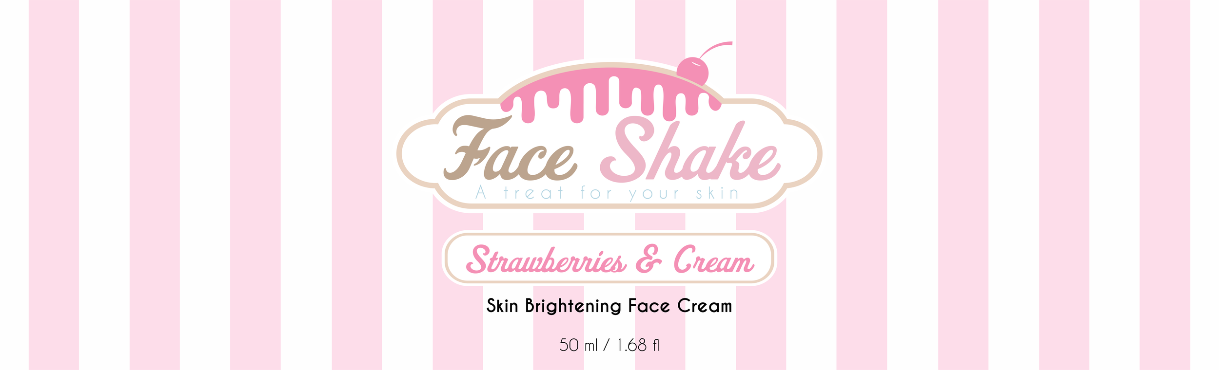
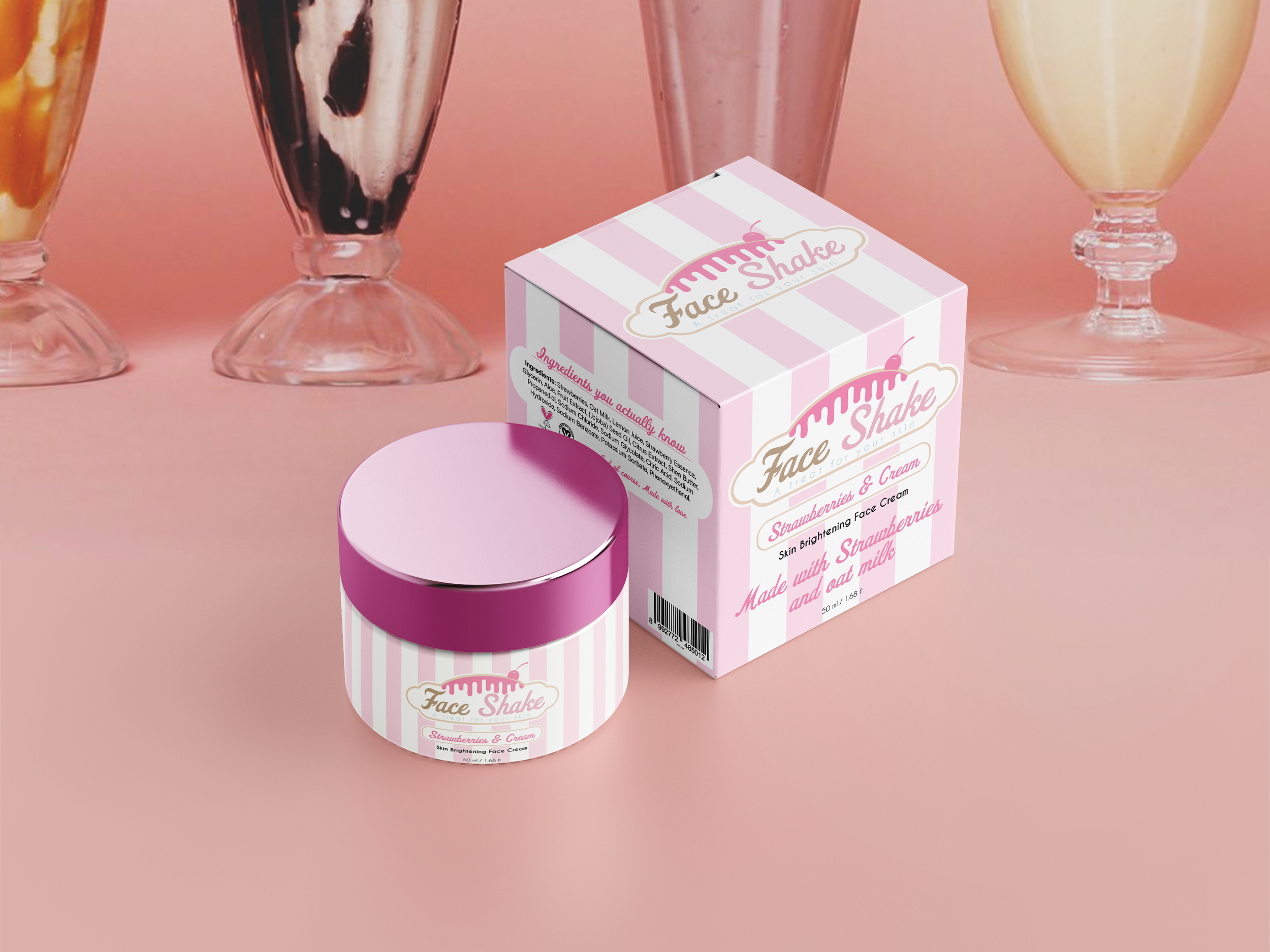
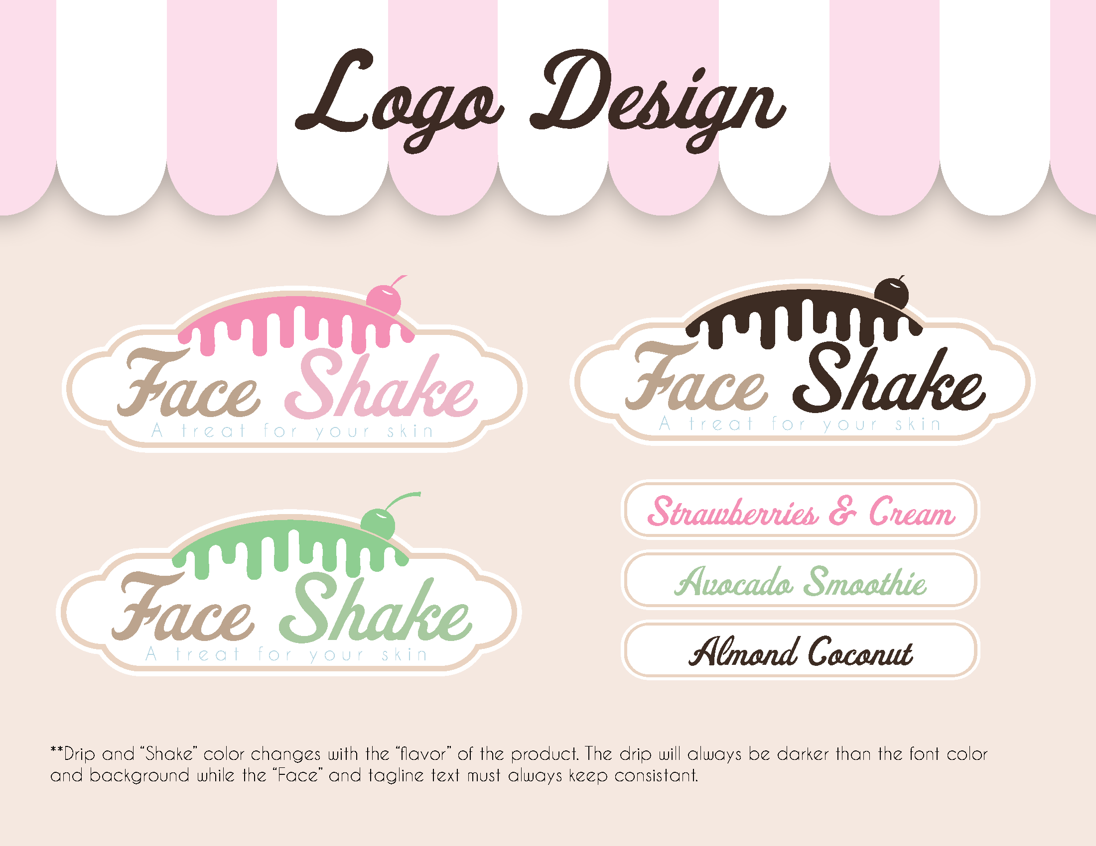
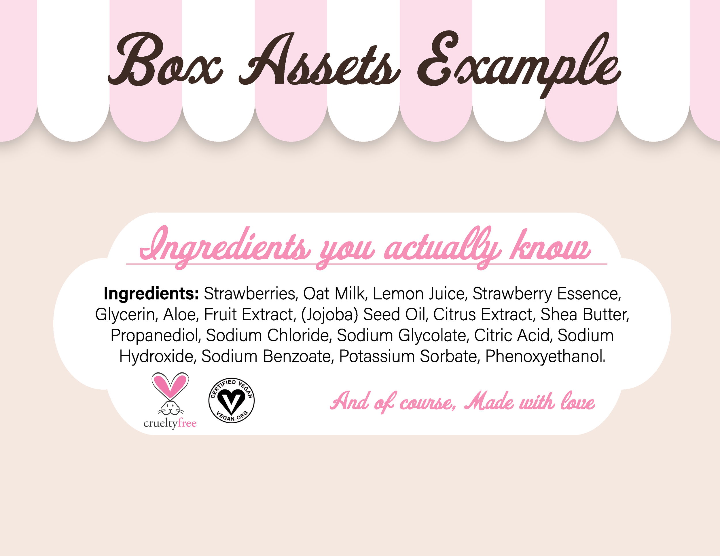
This is a package design concept for "Face Shake," a made-up skincare brand. The whole idea is that it's packed with natural ingredients – stuff so good, you'd almost think you could eat it. With everyone being super into natural products, "Face Shake" was all about building trust by being upfront and using ingredients that are more well known.
What I Played Around With:
The Feel: Using eco-friendly materials that feel nice to touch, giving it that natural but still kinda luxe vibe.
The Look: I wanted the design to be playful and reflect that retro milkshake bar feel. The cute design would make the product stand out against the more sterile products you would see on the shelf.
Being Upfront: Making sure all the natural, good stuff was easy to find on the label. No hiding ingredients here!
What I gained:
"Face Shake" is a neat way to do skincare branding because it taps into what people want – natural, transparent products while keeping it fun and relatable.
This whole project showed me how much packaging can do such as:
Really tell a brand’s unique story, especially when it's blending natural with a bit of fun.
Help people trust a brand by showing off how pure and understandable the ingredients are.
Make a brand pop in the crowded natural skincare aisle, all thanks to a fresh idea and a design that backs it up.
Basically, playing with the "Face Shake" packaging was a great example of how smart design can bring a cool brand concept to life and get people interested by leaning into those relatable ideas of "natural" and "trustworthy."